The Meaning Behind Our Logo and an
Introduction to Our Official Character
The Meaning Embodied in
Our Logo
Design

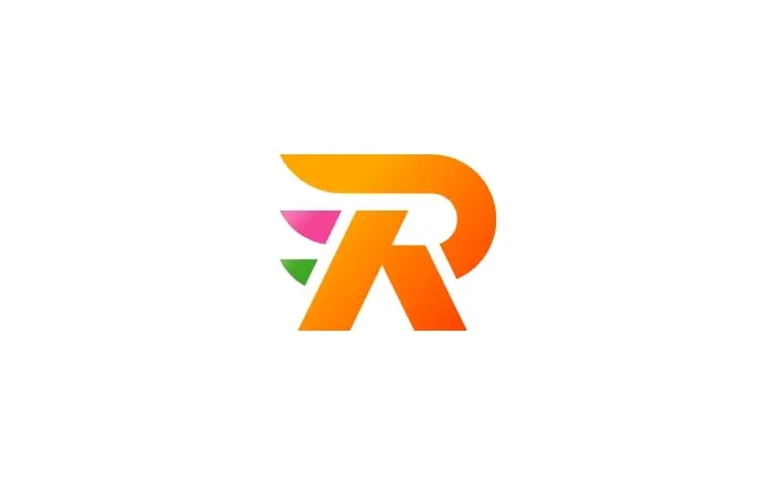
Our logo, which combines the letter “R” with the kanji character for “person,” represents all the stakeholders who support ROKITECHNO.
It also reflects our determination to become a “100-Year Company” and move forward into the future together.
The triangle motif on the left increases in size from bottom to top, visually representing the growth of our business and the speed at which we are expanding into new fields. It symbolizes the nature of our ongoing evolution––strong yet flexible.

The “O” element is composed of three parts, representing the Omi merchants’ philosophy of Sanpo Yoshi (good for the seller, good for the buyer, and good for society). The philosophy of conducting business with the buyer’s interests as the top priority—rather than based merely on the seller’s convenience—and contributing to local communities through this approach to commerce is deeply aligned with our corporate mission: “to be the number one partner to our customers” and “to contribute to industry, the environment, and society.”
Furthermore, the rounded curves at the bottom of the “O” element embody our behavioral guideline of “always smile.”
This design expresses our commitment to staying positive and continuing to move forward with a smile, no matter the circumstances.
Corporate Colors
The use of gradation adds depth and a sense of three-dimensionality to the design.
This expresses ROKITECHNO’s commitment to evolving with the times as we work to become a “100-Year Company.”
In addition, the three corporate colors used in the logo reflect our philosophy and unique identity.
Together with these colors, we will continue to take powerful steps into the future.
-
ROKI Orange
Represents the potent energy driving our business growth. It expresses our passion for advancing technology, developing new businesses, and taking on challenges to create a brighter future.
-
ROKI Pink
Represents the smiling faces that fill our company and the open communication between employees. It symbolizes our unified commitment to realizing our dreams.
-
ROKI Green
Represents our consideration for the environment, trust in cleanliness, and ecological awareness. It embodies our desire to remain a trusted company.
Meet Our Official Character
The triangular motif on the left side of the symbol logo resembles the dorsal plates of a dinosaur, which inspired us to adopt the dinosaur as a motif. Dinosaurs are not only a symbol of strength, but also of evolution, having adapted and transformed repeatedly throughout the Earth’s long history. In the same way, we at ROKITECHNO have embedded in this design our aspiration to evolve and grow with strength, while continually adapting to the changing times.

Profile
-
Birthday
December 12th
-
Gender and Age
Details not disclosed
-
Personality
A free thinker who is not bound by conventional ideas. Turns changes into opportunities and immediately takes on any challenge that comes to mind!
-
Attractive feature
It is characterized by its big eyes and dorsal fin.
-
Interest
My hobbies include trying new things and watching baseball.
-
Favorite things
Edible flowers and leafy greens.
-
Body length
about 2 meters
※Still evolving! -
Body weight
about 2 tons
※Still evolving! -
Special skill
Making people in the world smile.


